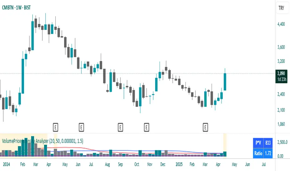
VolumePrice Intensity AnalyzerVolumePrice Intensity Analyzer
The VolumePrice Intensity Analyzer is a Pine Script v6 indicator designed to measure market activity intensity through the trading value (Price * Volume, scaled to millions). It helps traders identify significant volume-price interactions, track trends, and gauge momentum by combining volume analysis with trend-following tools.
Features:
Volume-Based Analysis: Calculates Price * Volume in millions to highlight market activity levels.
Trend Identification: Plots 20-day and 50-day SMAs of the trading value to smooth fluctuations and reveal sustained trends.
Relative Strength: Displays the ratio of daily Price * Volume to the long-term SMA in a separate pane, helping traders assess activity intensity relative to historical averages.
Real-Time Metrics: A table shows the current Price * Volume and its ratio to the long SMA, updated continuously with bold text formatting (v6 feature).
Alerts: Triggers notifications for high trading values (when Price * Volume exceeds 1.5x the long SMA) and SMA crossovers (short SMA crossing above long SMA).
Visual Cues: Uses dynamic bar colors (teal for bullish, gray for bearish) and background highlights to mark significant market activity.
Customizable Inputs: Adjust SMA periods, scaling factor, and alert threshold via the settings panel, with tooltips for clarity (v6 feature).
Originality:
Unlike basic volume indicators, this tool combines Price * Volume with trend analysis (SMAs), relative strength (ratio plot), and actionable alerts. The real-time table and visual highlights provide a unique, at-a-glance view of market intensity, making it a valuable addition for volume and trend-focused traders.
Calculations:
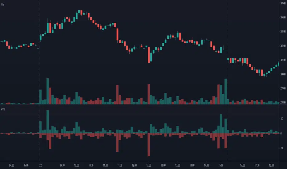
Trading Value (P*V): (Close * Volume) * Scale Factor (default scale factor of 1e-6 converts to millions).
SMAs: 20-day and 50-day Simple Moving Averages of the trading value to identify short- and long-term trends.
Ratio: Daily Price * Volume divided by the 50-day SMA, plotted in a separate pane to show relative activity strength.
Bar Colors: Teal (RGB: 0, 132, 141) for bullish bars (close > open or close > previous close), gray for bearish or neutral bars.
Background Highlight: Light yellow (hex: #ffcb3b, 81% transparency) when Price * Volume exceeds the long SMA by the alert threshold.
Plotted Elements:
Short SMA P*V (M): Red line, 20-day SMA of Price*Volume in millions.
Long SMA P*V (M): Blue line, 50-day SMA of Price*Volume in millions.
Today P*V (M): Columns, daily Price*Volume in millions (teal/gray based on price action).
Daily V*P/Longer Term Average: Purple line in a separate pane, ratio of daily Price * Volume to the 50-day SMA.
Usage:
Spot High Activity: Look for Price * Volume columns exceeding the SMAs or spikes in the ratio plot to identify significant market moves.
Confirm Trends: Use SMA crossovers (e.g., short SMA crossing above long SMA) as bullish trend signals, or vice versa for bearish trends.
Monitor Intensity: The table provides real-time Price * Volume and ratio values, while background highlights signal high activity periods.
Versatility: Suitable for stocks, forex, crypto, or any market with volume data, across various timeframes.
How to Use:
Add the indicator to your chart.
Adjust inputs (SMA periods, scale factor, alert threshold) via the settings panel to match your trading style.
Watch for alerts, check the table for real-time metrics, and observe the ratio plot for relative strength signals.
Use the background highlights and bar colors to quickly spot significant market activity and price action.
This indicator leverages Pine Script v6 features like lazy evaluation for performance and advanced text formatting for better visuals, making it a powerful tool for traders focusing on volume, trends, and momentum.
อินดิเคเตอร์ Pine Script®